
Testinsight
A comprehensive rebranding project for Testinsight, spanning logo renewal, a narrative-driven color system, and full website design. The new visual identity was built around a cohesive brand story, with a color palette that carries meaning rather than decoration. Complex technical diagrams were reimagined for clarity - distilling dense information into clean, intuitive visuals. The redesigned website brings it all together, presenting the company's full product suite in a structured, engaging experience.


Rebranding
Testinsight builds testing solutions for the semiconductor industry. The silicon wafer isn't a metaphor - it's their world. I chose it as the visual foundation for the rebrand: from design to test, its shifting gradients - purple into teal - became the color language of the brand.
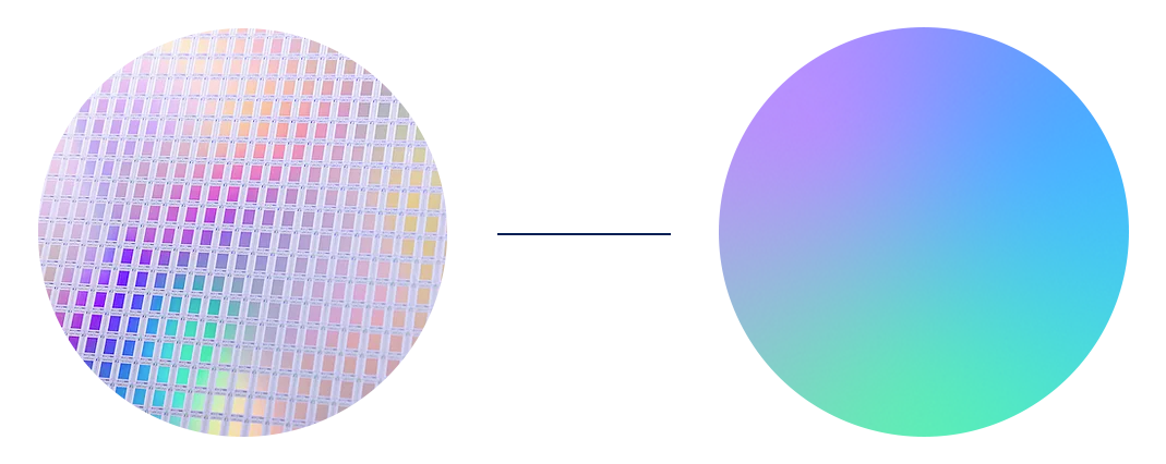
Colors
The design concept is inspired by the metro, reflecting fast, precise movement from point to point.
The visual language conveys a high-speed flow where security moves effortlessly without slowing things down.
Curation concept
Curation is a JFrog security product designed to block artifacts at the entry point before they get inside.
The visual concept was to illustrate the idea that anything unsuitable simply doesn’t get in, much like a sorter cube.

Leap
Concept development for events and exhibitions, including space branding, giveaways, t-shirts, presentations, and a registration landing pages.


Conan
Mascot design, marketing materials, website, and info pages - all in a new brand identity,
along with a deck of cards printed as a gift for clients.


Social
Marketing materials for social: posts, blogs, events, webinars.


Internal project


